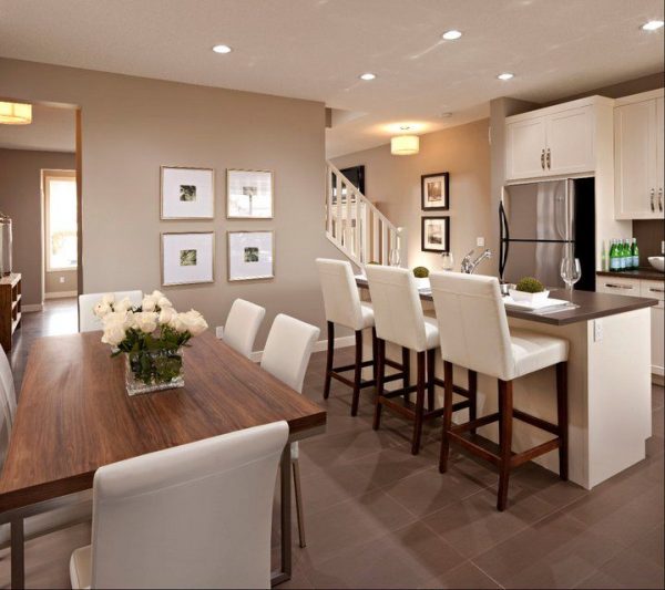
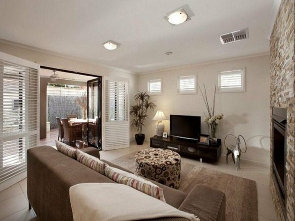
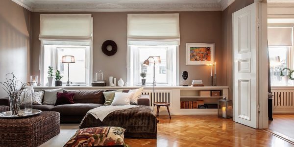
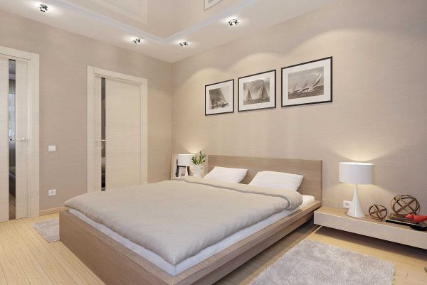
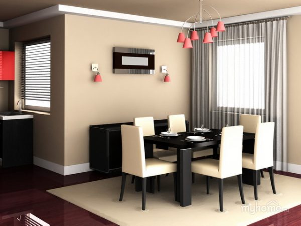
The color of cappuccino is an interesting caramel shade that is inherent in the coffee drink of the same name. When decorating an apartment, this tone is often used, because it is considered fashionable and goes well with other shades.
- Psychology and color features
- Combinations with other colors.
- White (Vanilla)
- Beige and Cream
- Olive
- Principles of creating an interior
- Walls
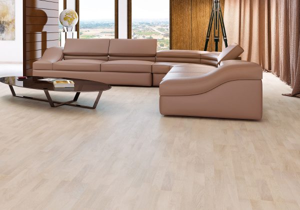
- Floor
- Ceiling
- Doors
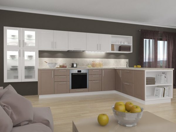
- Furniture and kitchen
- Decor
- Lighting

In a room dominated by a coffee palette, a person feels calm and protected. The color of cappuccino in the interior is used to create a special, warm atmosphere that inspires thoughts of a cup of delicious drink.
to contents ↑Psychology and color features
The hue of the cappuccino is quite light. It is slightly darker than beige, but lighter than brown, because in the color tables it takes an intermediate place between them. In psychology, dark brown tones are perceived by a person ambiguously: they can be associated with wilting, fallen leaves, longing. But light tones of brown are “warming” colors: they literally radiate the warmth of the hearth. Usually they are chosen by people over 30 years old, who are already striving for peace, but prefer to do this with the use of fashionable solutions.
Cappuccino color reminds not only of coffee, but also of natural landscapes, animal skins, it is also associated with cakes and pastries, causing pleasant thoughts. That is why cappuccino is used to create a certain atmosphere, to ensure comfort in the house.
With sufficient lighting, the walls, especially with gloss, begin to glow themselves, so this shade is well suited for northern rooms. In general, there are several tones that are combined into a cappuccino group: from yellowish to grayish.
Cappuccino is used very often in the interior, as it has the following advantages:
- the ability to completely change the look of the room without radical decisions (by introducing furniture, textiles, decor);
- relevance in all types of rooms and in almost any style;
- compatibility with many popular colors;
- suitability for large and small-sized rooms.
Cappuccino is suitable for the background in the room, but it can be used accent, as well as in the form of finishes for the ceiling, floor. This allows us to consider it universal, which only increases the list of advantages.
to contents ↑Combinations with other colors.
Best of all, cappuccino is in harmony with “close relatives”: light brown, hazel, beige, sand, gold, caramel, chocolate. No less beautiful is the combination of colors like cappuccino with white, black, gray, wheat, ivory, champagne, olive. A light coffee tone can become the basis for the formation of the interior, so more juicy accents will look wonderful against its background:
- pink;
- blue
- reds;
- Cherry
- lilac.
Despite the variety of possible combinations, designers often use the three most popular duos with cappuccino.
to contents ↑White (Vanilla)
The lightest shade of the palette is so gentle and beautiful that it fits absolutely any color, including cappuccino. White will visually expand the space, give the room airiness, lightness, it is best to include it in the interior of small rooms. Vanilla is considered a warm undertone of white.It is not as cold as snow-white, therefore it looks better in rooms with windows facing north. In combination with cappuccino, white can be either a background or used in detail.
to contents ↑Beige and Cream
Both shades are neutral, therefore suitable for any color palette. Usually, beige is made the base in the room: wallpaper, wall paint, and plaster can have this color. In the kitchen, in beige tones, furniture is often made: a suite or a dining group. Paired with a cappuccino, the interior will look expensive, elegant, but at the same time cozy at home. In a small room, adding dark tones is not required, and in the spacious you can enter chocolate or black notes.
to contents ↑Olive
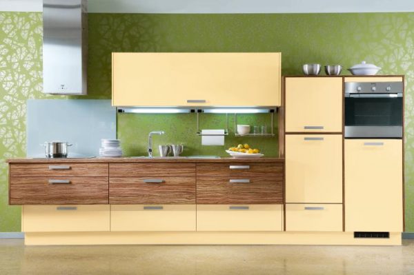
The olive shade is considered soft, warm, it is very favorable for the mental health of a person. The combination of cappuccino and olive gives the interior a close proximity to nature, therefore it can be diluted with other woody and sunny tones, as well as green. A duet of cappuccino and olive can decorate the kitchen, made in rich colors, to reduce the excessive brightness of the colors.
to contents ↑Principles of creating an interior
When planning the interior, the main thing is to exercise moderation, otherwise a long stay in the room will be uncomfortable. This is especially true for choosing contrasts and determining their quantity. The dominant role should be played by cappuccino, all other colors are added to a lesser extent, although the opposite combinations are possible.
In the kitchen, it is better to use washable coatings: wallpaper, panels that will be not only stylish, but also practical. Overloading the premises with too dark tones should be excluded: usually an accent wall or textiles, decor in more saturated colors are enough.
If cappuccino is used, in addition to it, it is undesirable to introduce more than two colors in the same room. It will look elaborate and unnatural, besides the natural magic of cappuccino will be lost.
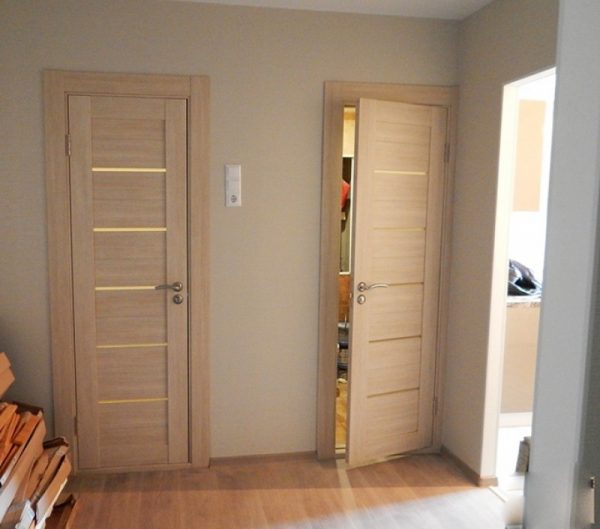
In any room, it is worth observing the rule: light colors are used at the top, darker colors are used at the bottom. In small rooms, it is recommended to select the lightest furniture, set white or beige interior doors to the walls of the cappuccino shade: this will give the impression of expanding the borders.
Other important room design rules:
- if the interior seems boring, you need to enter 2-3 bright spots into it;
- the abundance of gray and black in combination with cappuccino should be avoided - the situation will become gloomy;
- cappuccino loves a combination of different textures, for example, wallpaper and plaster, or heterogeneous types of furniture facades, wood and rattan, cork.
Walls
The selection of color for the walls is directly determined by how high-quality lighting is. If the windows of the room face north, it is better to choose only warm light colors for decoration. Southern rooms usually have excellent natural light, which is why they often use cool shades of cappuccino with a grayish tint.
How can I decorate the walls? Depending on the purpose of the room, the material of execution in coffee color may be different:
- ceramic tile;
- paint on putty or drywall;
- decorative plaster - bark beetle, Venetian, stone-like, etc.
- washable or paper wallpaper;
- natural and artificial stone;
- brick;
- tree;
- panels, including stone ones;
- bung;
- bamboo.
Cappuccino in the color of the walls is perfect for all the most popular styles. The color is ideal for hi-tech, minimalism, classic, modern, provence. Natural or modern synthetic materials, gloss and matte coatings are welcome depending on the style. In the kitchen, an apron is popularly decorated with tiles of a contrasting tone, for example, chocolate, in combination with a light coffee set. The walls can have a beige color, while one of them is accented: they are painted in cappuccino or a fresco is glued, photo wallpaper in such colors.
to contents ↑Floor
Light floors are usually selected for small rooms to visually expand the space. If the room is dark, then a light flooring will be the best solution.Where sizes allow, use darker tones for the floor: chocolate, coffee, to create an interesting contrast with the walls.
to contents ↑In the kitchen you can apply a chess type of floor finish - a combination of white, beige tiles with cappuccino tiles. An option for making a bulk floor is possible, which will provide an expensive, aristocratic look to the room. The most economical finishing methods are laminate and linoleum, which are sold in a wide range and include different options for shades of cappuccino.
Ceiling
The choice of a suitable shade for the ceiling is very important: the general appearance of the room will depend on it. Before painting or installing the suspended ceiling, it is necessary to take into account the indicators of illumination, the quadrature, the color of the oversized furniture: sofa, walls, set. If it is decided to use cappuccino for the ceiling, it is better to choose the most delicate, pastel colors: they will add airiness.
to contents ↑For low ceilings, it is also worth choosing the lightest colors or still prefer white paint. A suspended ceiling can combine white and cappuccino: usually the center is drawn up last, and the edges are made snow-white.
Doors
Often, the selection of colors for door leafs is difficult. The door can be in harmony with the floor, skirting boards or be contrasting or repeat the shade of the walls, textiles. The darker the door background, the stricter the interior looks.
Doors can be made of different materials: natural and artificial. The most expensive option is a natural tree, but it is environmentally friendly and incredibly beautiful. The cost of veneered doors is much lower, although they also vary significantly in price depending on quality. The most expensive in this category is eco-veneer - a coating that accurately imitates the wood structure.
The choice of door design in a cappuccino tone should depend on the style and personal preferences. Most often, customers buy simple, classic doors with a pattern, glass or without them. Non-standard designs are also being implemented: mounted, sliding, folding, but it is better to entrust their installation to specialists.
to contents ↑Furniture and kitchen
The furniture should be plain or combine 2 shades: cappuccino and a color that is well suited to it. The latter may be contrasting or neutral. If you want to create a feeling of a drink in a cup, make furniture using the ombre technique, where light tones smoothly turn into darker ones.
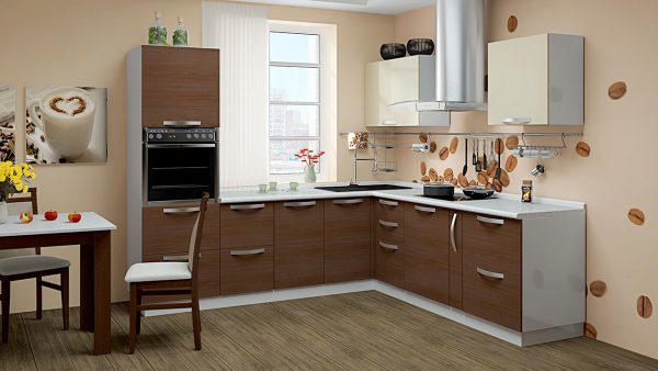
Light furniture is chosen if there is a color-saturated floor, lush wall decoration. Furniture handles can be gold, chrome, silver. Kitchen units in cappuccino color often have complex facades with fragments painted in different shades of this tone. With the help of lighter or more saturated coffee colors, you can make various geometric patterns or design the headset in a classic way (top - light, bottom - dark). Also, the upper facades can be red, purple, and the lower ones - a shade of cappuccino, which will look no less stylish.
to contents ↑Decor
Usually fabrics for curtains, upholstery of a sofa or wraps for upholstered furniture are chosen in a color similar to the shade of the walls. But small textile elements: pillows, napkins, pot holders in the kitchen - should be contrasting, this will bring joyful notes to the interior. Light, natural fabrics are used, rough textures are also welcome.
The tulle in the room can be made white, beige, while the curtains are in the color of cappuccino. Decor items can also be contrasting or also coffee: vases, bowls, figurines, picture frames. In the kitchen, it is recommended to hang a picture with the image of coffee beans: this will enhance the charm of the shade of cappuccino. Living plants, which are suitable for any room in the house, will help to make the interior more harmonious.
to contents ↑Lighting
The main light source is a central chandelier. In the classic style, lamps with elements of glass, crystal, metal are used. Small lighting fixtures are placed in a group of three to four pieces in order to focus on them.
Additional lighting is selected depending on the purpose: for example, in the kitchen it will be needed in the working and dining area, in the hall - in the place for a secluded relaxation, in the nursery - on an impromptu playground. As a decoration, small sconces are used, floor lamps that give diffused light, provide the room with a finished look.
Cappuccino color can transform any room. It is advantageous to use it in the kitchen, in the bedroom, living room, hallway: comfort, calmness and a unique “coffee” atmosphere will be waiting for households everywhere.

