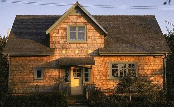
Choosing the colors of paints for the facade of the building, you need to decide on the tasks. If you harmoniously fit the structure into the natural landscape, green and brown tones will do. If, on the contrary, you need to highlight a private house against the background of the surrounding nature, you can use red or orange paint. On compliance with the architectural objectives of different color groups will be discussed below.
- Color options
- Color solutions for walls
- Color solutions for roofing
- Building materials compatibility
- Additional factors when choosing colors
- Useful Tips
- Right and wrong approaches
- Color compatibility chart

Color options
Using color, you can achieve a number of effects:
- hide the flaws of the building or vice versa;
- emphasize successful architectural solutions;
- visually change the shapes of structures;
- increase or decrease insolation.
The latter factor is especially important in areas with too cold or vice versa - too hot climate.
Features of different color groups:
- According to physical laws, dark surfaces attract light to themselves. In connection with this feature of heat absorption in the southern regions, roofs and other facade elements of light tonality are preferable, and in the northern places dark exterior coatings are more popular.
- Resistance to sunlight. Bright, saturated colors burn out to a greater extent. Black is particularly prone to fading. Light colors do not fade so much under the sun. However, a remark should be made here: the lightest color - white - is prone to yellowing. The most UV-resistant color is gray. Coatings painted with gray paint do not turn yellow, and dust is almost invisible on them. After many years, gray color can only change the shade, but nothing more.
- Visual impact. Light colors create the illusion of increased size, and therefore are often used in architectural structures designed to amaze with their grandeur and scale.
- Objects dominated by light beige and cream tones look faded. However, the same tones in combination with dark elements look very noble.
- The brown background resembles copper, dry foliage, amber, chocolate or tree bark. With skillful use, the brown color looks very rich.
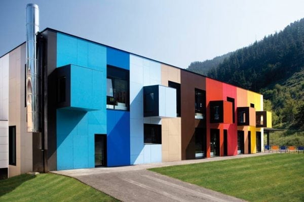
- Complex structures painted with bright, very saturated colors often look intrusive or ridiculous. For such options, it is better to use light colors. But bright colors are suitable for coloring simple forms, in which there is no pronounced local detail.
Color solutions for walls
Existing options:
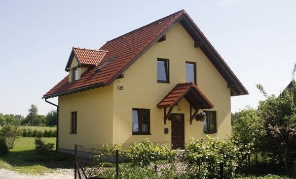
- The most common exterior wall painting solutions are beige, green, yellow and brown. These colors blend well with each other. For example, the yellow walls are perfectly complemented by dark wood windows and doors.
- Often, classic colors are used for painting walls - white and gray. White background is neutral by definition, it can easily be combined with any color. Especially advantageous are the white walls against the backdrop of green spaces surrounding the building. The gray surface, despite its apparent fading, helps to focus on individual elements of the house painted in brighter colors (doors, windows, drainpipes).
- Red colors are also often used on facades. Most often it is more likely a shade of brick color. A surface gets a similar shade when it is faced with clinker tiles, bricks, and tiles. Perfectly combined with a brick color light roof and windows.
- Blue background compatible with gray, beige and white colors. The building with blue walls, gray roofs and white windows takes on an elegant look.
- Purple, dark blue or black walls are a pretty bold choice. Facades with such colors are used in cold areas, as well as in a minimalist style of architecture. Dark tones rarely rarely completely dominate the surface finish; they are usually combined with light elements.
- The greenish-gray walls blend well with the natural landscape.
- White and blue coloring of the walls looks elegant and is in harmony with the sky and clouds.
- If the walls are painted with white paint, in winter they will merge with the surrounding space.
Color solutions for roofing
The choice of colors for roofs is more limited in comparison with facades. However, in principle, the method of choosing the color does not differ: light surfaces reflect light, dark ones have maximum absorbing properties. Ultimately, the decision depends on the climate of the region where the building is located, as well as on the individual needs of the owner of the house.
It is necessary to clarify - the color palette has a significant impact on the microclimate inside the building, however, modern insulating materials can significantly offset this effect.
The choice of color is usually determined by the choice of material that will cover the roof. Among these materials, the most popular are:
- shingles;
- rebate roof;
- metal tile;
- cement tile;
- metal sheets.
The most common color schemes for house roofs are green, red, blue, gray and brown. Among the frequently encountered color combination schemes, one can distinguish the following:
- Dark top with a bright lower part of the house. This combination is most in line with tradition. In this case, the light walls contrast effectively with the darker roof. Additionally, you can focus on contrasting elements - a socle, doors or windows.
- The same tone of the facade and the roof, which emphasizes the solidity of the building, although such solutions look boring.
- Light roof with dark walls. In this case, the main attention is paid to the walls, while the roof, as it were, merges with the sky. Doors and windows matching the tone will fit the light roof.
Building materials compatibility
When choosing color combinations, it is recommended to rationally approach the choice of building materials. For example, brick structures are uncharacteristic for some regions, and most buildings are constructed of wood. In particular, wooden buildings with shingle roofs are common in Transcarpathia. Materials are not only available in the area, but also combine well in color.
In some cases, the wooden structure can be tiled. This is quite acceptable, although not the most common combination. Instead of ceramics, terracotta shingles are sometimes used. But it is not recommended to combine metal tiles with wood, since such a solution does not differ in attractive appearance.
Roofing materials are easier to combine with masonry. The terracotta background will smooth the dark brown, grayish, green or red tiles. You can also use metal, bituminous material or copper. To a dark brick, a lighter roofing material (for example, gray) is well suited.
Roofs of any kind are suitable for walls covered with plaster.In this case, you need to think about the compatibility of certain colors with each other. If the homeowner prefers classic, you can use copper sheets or roof tiles made from natural materials. For buildings in high-tech style, black or silver bituminous tiles are suitable.
to contents ↑Note! Black, gray and white colors are combined with any shades. For example, gray gutters or black railings accentuate the color of the walls or roof. Details of the building can also be specially selected in the color of the roof or walls.
Additional factors when choosing colors
The harmony of colors of the various elements of the building is an important, but not the only rule. The surrounding natural environment and other nearby buildings should also be taken into account. For example, it is desirable to take into account the color background of neighboring houses. This does not mean that you need to repeat other people's color schemes, but you should keep them in mind if you want to integrate into the general tone of the surroundings or, conversely, to tastefully emphasize the individuality of your home.
If there is an abundance of vegetation around the buildings, the facade can be painted green or brown. If the house is near the beach, the walls are suitable for blue, coral, beige or birch tones. It is also worth considering the fact that some elements of the building remain unpainted (for example, railings, wooden parts, steps).
to contents ↑Useful Tips
If you have doubts about your own artistic taste, you can entrust the selection of color to design specialists. It is also worth trying special software that allows you to “put on” multi-colored patterns on building elements. You can also look at color samples at special demonstration stands in construction stores.
The way the human eye perceives color is influenced by various factors and, first of all, the type of lighting and surface texture. Therefore, before buying paint for the entire amount of work, you need to apply test strokes to a small area.
Usually, to understand what a paint and varnish composition is, a square meter of the surface is enough. However, one assessment will not be enough - it is recommended to apply paint several times during the day under different lighting conditions. The fact is that the same paint in a bright or dark room can look completely different. Therefore, it is worthwhile to carefully evaluate the painted surface in daylight and artificial lighting, comparing your expectations with reality.

The feeling of color in each person is different, that is, very subjective. If discomfort arises when looking at even the most fashionable coloring of the surface, do not follow the fashion trends. Wet asphalt, Sicilian orange, anthracite, salmon, etc. - All of these color names are just marketing moves by sellers to attract customers. Therefore, the best criterion for the final choice of paint should be a sense of inner comfort when looking at the painted surface.
to contents ↑Right and wrong approaches
Good examples:
- selection of related shades;
- opt for natural colors found in nature;
- the use of light, pastel colors in large areas and bright or dark to emphasize small details;
- reduction of the color gamut to 2-3 primary colors used when painting the surface.
Bad examples:
- colors do not match or contrast too much;
- the surface is too plain, there are no small interesting details or accents on it;
- the use of too bright colors;
- excess decorative elements and excessive multi-color surface.
to contents ↑
Color compatibility chart
The mutual compatibility of closely related colors is called color harmony. The greatest authority in determining color harmony was gained by Max Luscher tables. This Swedish psychologist developed the so-called color psychodiagnostics, which allows to determine the most comfortable and uncomfortable color combinations. The figure below shows a table compiled in accordance with the recommendations of Lusher.

