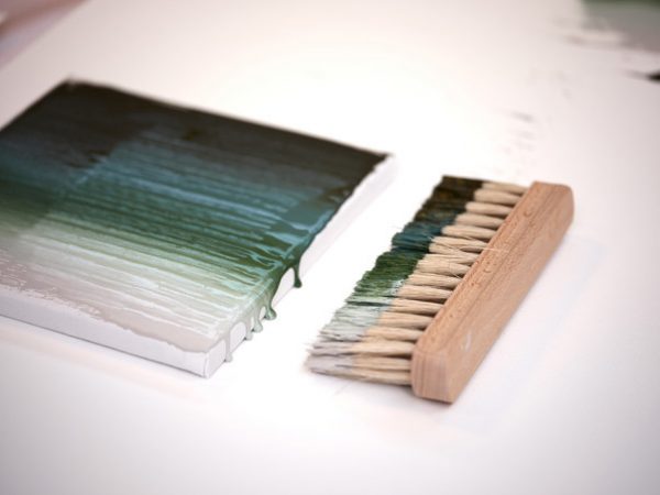
Silent Dawn - color of 2020

Every year in early autumn, employees of AkzoNobel, a leading manufacturer of paints and varnishes, call the key color of the coming year. It is determined as a result of a global study of the design, social, economic directions of the development of society. When choosing, the average statistical data on the behavior, mood, and desires of people are necessarily taken into account.
An analysis of global trends allows us to make an overall picture, based on which the main color of the coming year is chosen. So, a shade of 2020 was declared "Tranquil Dawn". This is a gentle pastel green color, subtly combining gray, green and blue tones. According to the results of the study, this shade will become a universal interior solution next year. It is in it that the harmony and tranquility are embodied, to which we are now so actively striving.
to contents ↑Color 2020
Helin Van Gent, creative director of the international aesthetic center, has been studying color trends for more than a year. According to her, “silent dawn” is associated with the color of the early morning sky and personifies the general mood of 2020. It reflects the desire to appreciate the basic human qualities that we will need in the new decade, characterized by the rapid development of artificial intelligence and technology.
We are on the verge of a new dawn, the goal of which is the search for meaning and creativity. It is time to create a cozy place where you can think about the future, chat with loved ones, accept yourself, and be alone with nature. “Silent Dawn” and its auxiliary color palettes will help bring freshness to the interior.
to contents ↑Palettes
Akzo Nobel is positioned as an expert in identifying global trends and creating inspiring color palettes that can transform any living space, emphasizing its individuality.
The organization developed 4 current Color Futures 2020 palettes, each of which included the basic shade of Tranquil Dawn. Their goal is to inspire the client, as well as facilitate his choice. Each decorative palette is dedicated to its theme:
- space for silence, recovery;
- space for life, energy awakening;
- space for meaning, contemplation;
- space for self-expression, creativity.
All sets of paints fully comply with the wishes of consumers.
Thus, experts in the field of coloristics set the direction that fashion houses, research centers, manufacturers of furniture, building materials, electronics, as well as companies specializing in interior design will adhere to.


