According to psychologists, children love green most of all. It is associated with growth, harmony in nature, development, is recognized as a motivating color. Usually green is realized in the main set of gouache of 6 tones, but professionals prefer to do it themselves.
- Coloring Basics
- Create color when combining colors
- Varieties of green and their manufacture
- Pale green
- Olive
- Bottle green
- Coniferous
- Green fern
- Forest green
- Light green
- Marsh
- Dark green
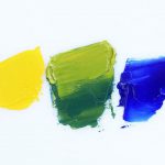
The fact is that this paint does not belong to the category of basic, which means that it can be made with color mixing. Everyone knows how to get a green color, but there are many ways to create its shades.
to contents ↑Coloring Basics
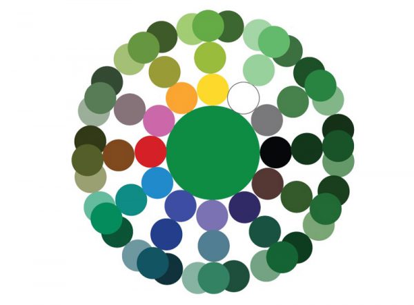
Coloring studies various shades, their possible combinations and is based on knowledge of the color wheel. Even a novice artist knows that there are well-mixed tones (chromatic) and those that when combined give a gray mass (achromatic).
to contents ↑Making green is easy - you need to have the basic tones of the palette (red, blue, yellow). Also, to create dark and light green shades, you need to purchase white and black paint. Changing their proportions will also allow you to play with color, get new effects and halftones.
Create color when combining colors
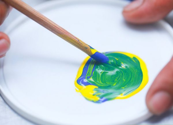
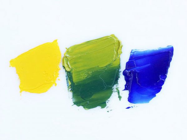
What colors to mix to get green? To answer the question, you need to look at how the color wheel looks. Green and its shades are located between yellow and blue, therefore, these tones will allow you to get the right color. Classic green can be made by combining equal proportions of these colors. All shades of green are obtained by changing the ratio or introducing new pigments.
to contents ↑Varieties of green and their manufacture
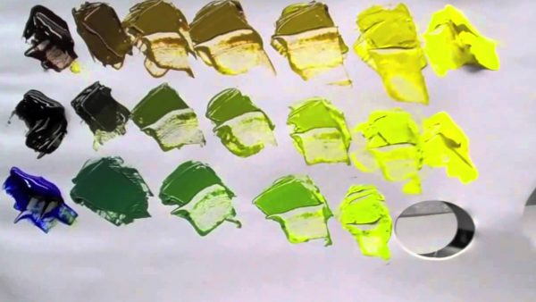
There are about 15 basic shades of green - from light (pale) to turquoise (blue-green). But there are more than 110 tones, very similar to the main, but having some nuances. For example, introducing a drop of blue into the base gives the effect of “cooling”, and such a color can be found in painting in winter landscapes. On the contrary, adding bright yellow to the base makes the main tone warmer, it turns light green, bright and spring.
to contents ↑Pale green
Soft pastel shades of green look very beautiful, soothing, because they are often used in the interior, as well as for painting walls in medical institutions, kindergartens, schools. Psychologists recommend using a pale green tint in bedrooms and children's rooms, because it sets up harmony, is useful for hyperactive children, and relieves stress. To get this color, you need to add white to the classic paint. You can also mix yellow and blue evenly, and then whiten the tone to the desired degree of clarification.
to contents ↑Olive
This color is considered very noble, it is respected by interior designers for its softness, richness and luxury. Olive is called a dark yellowish-green color - a shade of the fruit of the olive tree. Making it yourself is difficult, but real. To do this, yellow is added dropwise to the greens, then a little brown paint is added to darken.
Bottle green
The color of bottle glass also belongs to the category of dark, this is a shade of the third order.The basis is taken all the same mixing of blue with yellow, but the latter in a slightly increased amount. After the paint is ready, black color is added to it. How much is needed is determined empirically. But if you overdo it, the shade will be dirty gray, and white will only lighten it, but will not save the situation. Some artists introduce blue instead - then the finished bottle color will have a bluish reflection.
to contents ↑Coniferous
Conifers are prepared as follows: a little yellow color is added to the classic green, and then a drop of black paint. As a result, you can get your favorite New Year's shade, which is widely used for festive drawings and landscapes. If you add white paint to the tone, you will get “needles in the fog”, which is also useful in painting.
Green fern
Not all the names of green tones are familiar to the average man, but the artists know them perfectly. For example, to get the tone, “green fern” is combined with classic green with a drop of black, then the color is bred with white. This shade is considered a transition from light to dark tones. Color is popular in the manufacture of billboards, banners, it is used for painting facades of houses, interior wall covering.
to contents ↑Forest green
Usually, classic green or this color with the addition of a minimum amount of yellow paint is used to reflect the colors of greenery, leaves, natural shades of nature. If you need to give the forest a gloom, a little black paint is introduced into the color. Forest greens can be used in the fight against depression, the tone is great for wallpaper, interior paint.
to contents ↑Light green
Green, mixed with yellow and white, gives a very beautiful shade - lime. He is so optimistic that it is used mainly for children's summer clothes, and only certain details are painted in the interior. The original combination is light green and pink - usually these colors are ideal for children's toys. Modern designers while sewing clothes for adults with the help of light green give a catch, expressiveness and a certain exotic style. By the way, if you introduce a lot of yellow into green, you get a lemon color.
to contents ↑Marsh
Khaki, or swamp color, is obtained by combining green, brown and a droplet of red paint. This tone is very practical in clothes, it masks well, therefore it was chosen as the main one for a military uniform. Swamp color is also used to create military-style clothes, and in the interior it is intended to ensure peace and tranquility.
Dark green
To darken the greens, black or brown is traditionally used - depending on the desired effect. The number of dark colors is also selected individually, by eye. This color may seem oppressive, because it is rather gloomy, therefore, it is used in the interior to a limited extent.
The variety of green tones is amazing. We must not be afraid of experiments, and then a picture made by ourselves can turn into a real masterpiece!

